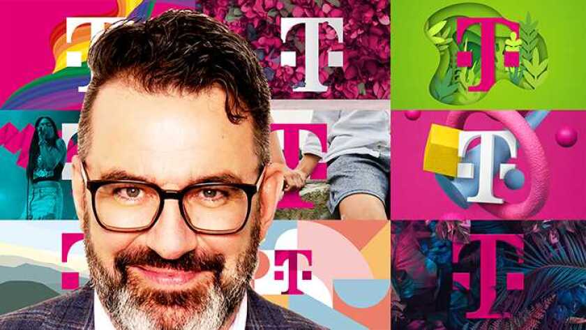
The company is also enforcing the use of its favourite colour, magenta, said chief brand officer Ulrich Klenke (pictured).
“Our global market approach is a key pillar of our international digital and sustainable corporate strategy,” said Klenke. “One purpose, one brand architecture, one logo, one claim, and one brand design – with our global brand strategy, we want to make our development to the ‘leading digital telco’ perceptible to everyone.”
It will be, said the company, “a uniform brand experience worldwide”. A YouTube video accompanying the announcement includes T-Mobile US, until now apparently a semi-autonomous operation, though one that uses the magenta T.
With the new version of the logo, “the curves have been optimised and the top, trunk, and foot have been reinforced”, said Deutsche Telekom.
Klenke said: “We plan to use the name to actively structure our international product portfolio in future, to set us even more apart from the competition.”
The company will use the revised T logo for the first time at Mobile World Congress (MWC), which starts in Barcelona in 11 days.
“Our brand presence will become clearer, more consistent, and more comprehensible across international borders – and thus more effective and more efficient,” said Klenke.


